

Key Takeaways
Dark Pattern
A dark pattern is a user interface design technique that deliberately steers website visitors into taking actions they didn't intend — such as signing up for a subscription, adding items to a cart, or sharing more data than necessary. These designs exploit cognitive shortcuts and attention blind spots to benefit the retailer at the consumer's expense. The term was coined by UX designer Harry Brignull in 2010.
Dark patterns are increasingly scrutinized by regulators; the FTC has issued enforcement actions and guidance specifically targeting deceptive interface designs in e-commerce.
What Dark Patterns Actually Are
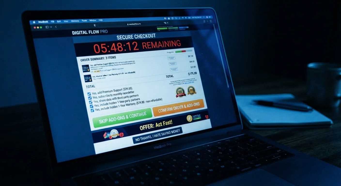
Most frustrating online shopping experiences aren't accidents. When a checkout page makes the 'decline the add-on' button nearly invisible, or when a site auto-enrolls you in a loyalty program via a pre-checked box, that's the result of deliberate design work — often tested and optimized to maximize unintended clicks.
Dark patterns exploit well-documented quirks in human attention. We skim rather than read. We assume defaults are neutral. We feel pressure when we see a timer. Designers who build these interfaces know this, and some build specifically around these tendencies.
Understanding that these are systems, not accidents, is the first shift that helps you shop defensively. For a broader look at how retailers engineer your decisions, see our article on common shopping deceptions.
A Note on Regulatory Context
The FTC has issued guidance and taken enforcement actions against companies using deceptive interface designs, particularly around subscription enrollment. However, regulatory definitions of what constitutes an illegal dark pattern are still evolving. Many manipulative designs remain in legal gray areas, which means consumer awareness is your most consistent line of defense.
The Six Most Common Dark Patterns at Retail Sites
While dozens of dark pattern variants have been catalogued, a handful show up most often in everyday retail shopping:
- Roach Motel: Easy to sign up, nearly impossible to cancel. Subscription services that require a phone call to cancel — but let you join with one click — are a classic example.
- Confirmshaming: Declining an offer is worded to make you feel guilty or foolish (e.g., a button that reads "No thanks, I don't want to save money").
- Hidden costs: Fees — for shipping, handling, or "convenience" — appear only at the final checkout step after you've already invested time in the purchase.
- Trick questions: Pre-checked boxes that opt you into newsletters, data sharing, or paid add-ons unless you notice and uncheck them first.
- Urgency and scarcity theater: Countdown timers and "Only 2 left!" warnings that reset or don't reflect real inventory conditions.
- Misdirection: Visual design that draws attention to a promoted option while making the neutral or free alternative harder to find.
~1,800
Dark pattern instances found in one major study
A Princeton and University of Chicago study (2019) identified approximately 1,818 dark pattern instances across 11,000 popular shopping websites.
11%
Shopping sites using at least one dark pattern
The same Princeton/University of Chicago study found roughly 11% of the shopping sites examined deployed at least one identifiable dark pattern.
Multiple states
US jurisdictions with dark-pattern-specific legislation
California's CCPA and subsequent state privacy laws have included provisions specifically targeting manipulative interface designs in consumer-facing digital products.
Why These Designs Work — And What Makes You Vulnerable
Dark patterns succeed because they exploit the way human attention and decision-making actually function under real shopping conditions. When you're distracted, tired, or moving quickly through a checkout, your brain relies on shortcuts — assuming defaults are safe, that prominent buttons reflect your interests, and that urgency signals are genuine.
This connects directly to how retailers compress your deliberation window. The psychological gap between impulse and considered purchasing is exactly the space dark patterns are designed to exploit. The faster you move, the more likely you are to miss a pre-checked box or accept an auto-added item.
Slow Down at the Payment Screen
Budget an extra 60 seconds at checkout to scroll the full order summary before entering payment details. Most dark pattern charges — add-ons, subscriptions, handling fees — appear somewhere in that summary if you look for them. This one habit catches the majority of unintended charges before they happen.
Cognitive load also matters. A checkout page with many steps, form fields, and competing visual elements taxes working memory — making it easier to miss fine print. That exhaustion isn't accidental.
A Practical Checkout Routine That Catches Most Tricks
You don't need to become a UX expert to protect yourself. A consistent checkout habit catches the majority of dark patterns before they cost you money:
- Pause before entering payment details. Scroll through your cart line by line and verify every item — including any "added for your convenience" line items.
- Uncheck all pre-selected boxes. Assume every checkbox is working against you unless you consciously chose it.
- Read the area immediately around the payment button. That's where subscription enrollment disclosures and terms are most often hidden.
- Question every timer. Artificial urgency is designed to stop you from thinking. If a deal requires a decision in the next 90 seconds, that's a signal to slow down, not speed up.
For additional ways that online retail engineering can push spending beyond your intentions, see how one-click checkout bypasses deliberate decisions.
This article is for general educational purposes. It does not constitute legal or financial advice. Readers with concerns about specific charges or deceptive practices should consult relevant consumer protection resources or a qualified professional.